


DENALI 電子風格指南
品牌指南概述
被看見,被聽見,盡情騎乘
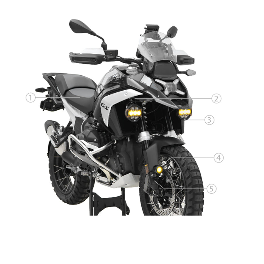
兩輪生活充滿危險——這也是它如此刺激有趣的原因!DENALI 成立於一個簡單的目標,這個目標至今仍是我們的使命……提供創新的照明與安全解決方案,幫助你被看見、被聽見,並能更盡情騎乘,同時不犧牲你的安全。

品牌名稱
在所有通訊、行銷材料、產品列表及品牌引用中,始終使用完整且正確的名稱 「Denali Electronics」。禁止單獨使用「Denali」,因為這可能會與其他同名品牌、地點或產品混淆。保持一致使用完整的 Denali Electronics 名稱,有助於保護我們的商標、強化品牌識別,並確保所有客戶接觸點的清晰度。


標誌
在任何帶有 Denali Electronics 品牌的網頁內容或印刷材料上,應始終使用完整的 Denali Electronics 標誌及其變體。較小的圖示/方形尺寸標誌僅應在無法容納完整標誌的空間中使用,或用於贈品如貼紙或襯衫。


顏色
Denali Electronics 的主要顏色是黑色和黃色。水藍色主要保留用於特定網站按鈕作為強調色,且不得用於此特定用途之外。
濃黑色:# 00000
冒險黃:# fff100
電光水藍:# 00e1ff

字體
「Myriad Pro」 是所有 Denali Electronics 品牌材料中用於段落和標題文字的主要字體。
「Gotham Black」 是用於網頁橫幅和印刷材料的主要粗體裝飾標題字體。